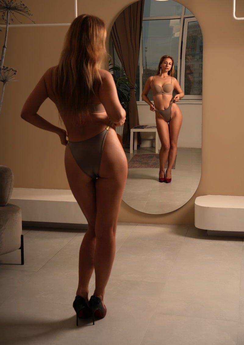
Colour is one of the easiest things to get right and one of the easiest to overlook. An outfit that clashes with the setting, or disappears into it, can make a good picture feel flat. A little thought about colour helps every picture look planned.
Look at the setting first
Before choosing an outfit, picture the place. A dark room, a pale studio and a green garden each ask for something different. Knowing the main colours of the setting makes it much easier to choose something that works with it.
Use contrast to stand out
A bright outfit against a muted background draws the eye straight to your character. A deep red in a grey room or a soft white against a dark wall are simple examples. Contrast does the work so the description does not have to.
Or blend on purpose
Sometimes you want a calmer, more harmonious feel. Choosing colours close to the setting, such as warm browns in a candlelit room, creates a gentle and cohesive look. Just make sure the face still stands out clearly.
Name the colour plainly
Simple colour words work best. Deep red, pale blue or dark green are easier to follow than poetic shades. Add one detail about the fabric if it matters, such as satin or lace, and leave it there.
Test and keep what works
Try the same outfit in two colours and compare the results. Keep a short note of the combinations you like. Over time you will build a small palette that you can rely on for every new picture.